


TL;DR: Risk heat map
- A risk heat map plots cyber risks on a grid by likelihood and impact, so the most severe exposures stand out.
- A risk matrix defines the scoring rules, while the heat map is the visual output built from those scores.
- Reliable heat maps depend on a clean risk register, written scoring criteria, and separate inherent and residual ratings.
- Heat maps simplify complex exposure, so cyber risk quantification adds value when leaders need financial comparisons.
- Scytale’s AI GRC platform connects risk data, controls, and treatment decisions in one place.
Cyber risk programs often generate more findings than security and compliance leaders can realistically rank, particularly as vendors, cloud environments, and regulatory obligations expand. Without a consistent approach to GRC risk management, organizations tend to prioritize the most visible issues rather than the ones most likely to cause material business harm.
A cyber risk heat map addresses this problem by giving security, compliance, and executive teams a common view of what deserves attention first and what can wait for a later treatment cycle. The visual, however, is only as reliable as the scoring behind it. In this article, we explain how to build a risk heat map, use it to prioritize cyber risk, and recognize where it falls short.
What is a risk heat map?
A risk heat map is a visual tool that plots risks on a color-coded grid according to their likelihood and potential impact, so the most severe exposures stand out at a glance.
Each entry from the risk register appears at the intersection of its likelihood score on one axis and its impact score on the other, with color bands showing whether it sits in an acceptable, moderate, or critical range. Because the map draws its inputs from existing risk records, every plotted point should trace back to a documented risk statement, owner, and set of controls.
Security and compliance teams rely on heat maps because they separate background noise from material exposure without requiring readers to review every line item. The format supports board reporting, treatment planning, and cross-functional discussions, since every stakeholder works from the same picture of exposure. That shared view only holds when impact and likelihood definitions remain consistent across business units and review cycles, as inconsistent definitions produce colors that suggest more precision than the underlying judgment supports.
Streamline GRC workflows with no blind spots.
Risk heat map vs risk matrix
Although often used interchangeably, a risk heat map and a risk matrix serve different purposes in the risk assessment process. A risk matrix provides the framework for scoring risks based on likelihood and impact, while a heat map visually presents those results to support prioritization and decision-making. Here’s how they differ:
The scoring framework
A risk matrix is the scoring framework that defines how teams rate likelihood and impact, typically on a 3×3 or 5×5 scale. It sets the rules of your risk assessment methodology and keeps scoring decisions consistent across reviewers.
The visual output
A risk heat map takes those scores and places each risk on the grid, turning the matrix into a communication tool for leadership. When an executive asks why a risk landed in the red zone, the answer comes from the matrix criteria rather than the visual itself, which is why most programs need both.
Risk matrix vs risk heat map at a glance
| Aspect | Risk matrix | Risk heat map |
|---|---|---|
| Primary role | Defines scoring rules for likelihood and impact | Displays scored risks visually on a grid |
| Main output | Scales, definitions, and score thresholds | Color-coded view of the risk portfolio |
| Primary audience | Risk assessors and control owners | Executives, boards, and cross-functional teams |
| Key question answered | How should this risk be rated? | Which risks need attention first? |
How to build a risk heat map, step by step
Building a risk heat map starts with identifying risks, defining consistent scoring criteria, and assessing their likelihood and business impact. The goal is to turn risk data into a clear visual that helps teams prioritize threats, allocate resources, and make informed treatment decisions. Here are eight steps to build a risk heat map using your organization’s risk register:
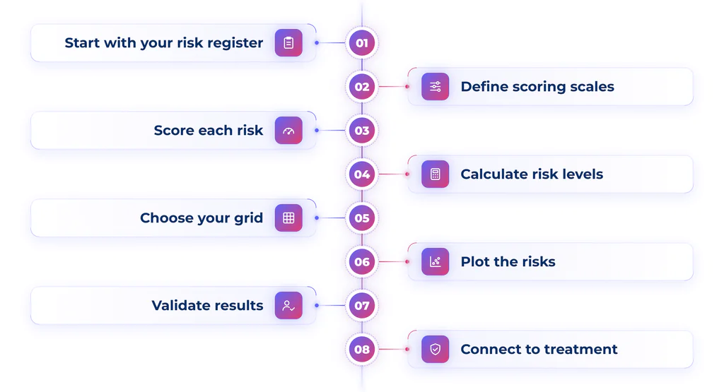
Step 1: Start with your risk register
Begin with an up-to-date risk register documenting cybersecurity risks, affected assets, existing controls, risk owners, and current status. Each entry should describe a specific risk that can be assessed and managed. A centralized register helps maintain consistent information across teams.
Step 2: Define your scoring scales
Establish clear criteria for evaluating risk likelihood and impact before assigning scores. Most organizations use a 1-to-5 scale, ranging from rare to almost certain for likelihood and insignificant to severe for impact. Define each level using factors such as financial loss, operational downtime, regulatory consequences, and reputational damage. Consistent criteria help teams assess risks using the same standards.
Step 3: Score each risk consistently
Evaluate each risk against your likelihood and impact criteria, documenting the reasoning behind each score. Effective risk scoring should draw on evidence, including historical incidents, security vulnerabilities, audit findings, threat intelligence, and key risk indicators. Applying the same methodology across your risk inventory reduces subjectivity and makes it easier to compare risks and identify priorities.
Step 4: Calculate inherent and residual risk
Assess both inherent risk, which represents exposure before controls, and residual risk, which reflects exposure remaining after existing controls are considered. For example, a high-impact cybersecurity threat may have a lower residual risk rating when strong security controls are in place. Comparing these ratings helps organizations evaluate control effectiveness, identify gaps, and determine where additional mitigation is needed.
Step 5: Choose your grid design
Select a risk matrix that matches your organization’s needs and risk management maturity. A 3×3 grid provides a simple overview using low, medium, and high ratings, while a 5×5 grid allows for more detailed assessments. Typically, likelihood appears on one axis and impact on the other. Choose a format that makes risk levels easy to interpret without unnecessary complexity.
Step 6: Plot the risks on the heat map
Position each risk on the grid according to its likelihood and impact ratings. For a 5×5 matrix using a multiplicative scoring method, multiplying likelihood and impact produces a risk score between 1 and 25. Apply predefined color categories, such as green for low risk, yellow for moderate risk, orange for high risk, and red for critical risk, based on your organization’s thresholds. Label each risk or link it to the register for easy identification.
Step 7: Validate the results with stakeholders
Review the heat map with security, compliance, IT, and business owners to confirm that ratings reflect operational realities. Stakeholders can provide additional context about business dependencies, control effectiveness, and potential consequences. Address scoring inconsistencies and update assessments where necessary to ensure the map supports reliable, evidence-based decisions.
Step 8: Connect the map to treatment decisions
Use the heat map to prioritize risk treatment, assigning each significant risk a response such as mitigation, acceptance, transfer, or avoidance. Document actions, owners, and deadlines in a risk treatment plan. Your broader risk management framework should guide ongoing monitoring and reviews. Update the map regularly, particularly after security incidents, infrastructure changes, or new regulatory requirements.
8 steps to build a risk heat map
| Step | What to do | Why it matters |
| 1. Start with your risk register | Identify risks, owners, and existing controls | Establishes a reliable risk inventory |
| 2. Define scoring scales | Set likelihood and impact criteria | Ensures consistent assessments |
| 3. Score each risk | Evaluate risks using available evidence | Supports accurate prioritization |
| 4. Calculate risk levels | Assess inherent and residual risk | Identifies remaining exposure |
| 5. Choose your grid | Select a 3×3 or 5×5 matrix | Makes risks easier to visualize |
| 6. Plot the risks | Map scores and apply color categories | Highlights priority risks |
| 7. Validate results | Review assessments with stakeholders | Improves accuracy and alignment |
| 8. Connect to treatment | Assign actions, owners, and deadlines | Turns risk insights into action |



Using a heat map to prioritize cyber risk
A risk heat map helps organizations strengthen their cyber risk management by identifying which threats require immediate attention and which can be addressed later. By visualizing risk levels based on likelihood and impact, teams can prioritize mitigation efforts, allocate resources, and make informed treatment decisions. Here are two ways to turn risk insights into action:
Turn the visual into treatment priorities
Start with the risks in the highest-impact, highest-likelihood zones. These items typically require immediate treatment plans, executive visibility, and closer continuous security monitoring, because delay increases the chance of material business harm. Next, review the risks in the middle bands. Some belong in the next remediation cycle, while others warrant watch status tied to defined indicators, so the team detects movement before a score worsens.
Add business context to investment decisions
Use the map alongside business context, your organization’s risk management framework and risk appetite rather than in isolation. A moderate-scored risk affecting a revenue-critical system may deserve faster action than a higher-scored issue tied to a low-value internal process. The map also informs investment decisions. If several red-zone risks trace back to the same control weakness, one targeted project often reduces more exposure than a series of isolated fixes, giving leadership a clearer rationale for the budget request.
Limitations of risk heat maps
Risk heat maps help organizations visualize and prioritize risks, but their simplicity can also hide important details. Understanding these limitations helps teams recognize when a heat map provides enough insight and when more detailed risk analysis is needed. Here are the main limitations to consider:
Where heat maps can mislead
Risk heat maps simplify complex risks into color-coded categories, which can obscure uncertainty, dependencies, and differences in potential impact. Their accuracy also depends on subjective scoring, meaning different teams may assess the same risk differently. Two risks placed in the same category may have significantly different financial or operational consequences. Heat maps also provide a point-in-time view of exposure, making regular updates essential as threats, systems, and security controls change.
When quantification adds more value
Heat maps are less effective at showing concentration risk, interconnected threats, and cascading events, where a single incident can affect multiple business operations. For more complex or high-impact scenarios, cyber risk quantification provides deeper insight by estimating potential financial losses. Frameworks such as Factor Analysis of Information Risk (FAIR) help organizations evaluate exposure in monetary terms, making it easier to justify security investments and compare treatment options. Many organizations use both approaches: heat maps for quick risk prioritization and communication, and quantification for high-stakes decisions requiring more precise financial analysis.
AI-native GRC for how enterprise teams work today.
How Scytale helps you visualize and prioritize risk
Risk programs break down when scoring, evidence, and treatment tracking live in separate tools. Scytale‘s AI GRC platform brings these workflows together, allowing teams to track risks, connect them to controls, and monitor changes across frameworks and systems from one workspace. With AI agents and 150+ integrations feeding live evidence into risk reviews, teams can see why a score changed and which control gap drove the shift, rather than relying on stale snapshots.
Scytale also maps controls across frameworks such as SOC 2, ISO 27001, GDPR, and SOX ITGC, supports continuous monitoring, and pairs automation with dedicated GRC experts who help teams turn heat map findings into treatment plans. The result is a risk view that stays current, supports consistent scoring, and gives security and compliance leaders a clearer basis for prioritizing cyber risk while maintaining audit readiness.
FAQs about risk heat map
How do you build a risk heat map for cybersecurity?
You build a cybersecurity risk heat map by starting with a current risk register, defining written likelihood and impact scales, and scoring each risk against those criteria. Teams then plot inherent and residual scores on a 3×3 or 5×5 grid, apply color bands, and validate the results with stakeholders before linking high-priority risks to treatment plans.
What are the key components of a cybersecurity risk heat map?
The key components are a likelihood axis, an impact axis, color-coded severity zones, and plotted risk points that link back to the risk register. Many heat maps also include a legend explaining the expected response for each zone and indicators showing whether a risk is rising, falling, or stable.
What is the difference between a risk heat map and a risk register?
A risk register is the detailed record of each risk, including its description, owner, controls, and status, while a risk heat map is the visual summary built from that data. The register supports day-to-day management, and the heat map helps leaders compare the overall portfolio at a glance. Leading AI GRC platforms like Scytale keep both connected, so changes in the register are reflected in risk reviews.
How do you determine which cybersecurity risks require immediate attention?
Risks with both high likelihood and high impact scores, particularly after accounting for existing controls, generally require immediate attention. Teams should also weigh business context, since a moderate risk affecting a revenue-critical system or regulated data may warrant faster action than its score alone suggests.
How can organizations use risk heat maps to improve cybersecurity decision-making?
Organizations can use risk heat maps to align security, compliance, and executive teams on priorities, direct budget toward the controls that reduce the most exposure, and track whether treatment efforts are working over time. Scytale’s AI GRC platform supports this by connecting risk scores to live control evidence, so decisions reflect current conditions rather than outdated assessments.